Overview
MessageList is a Composite Component that displays a list of messages and effectively manages real-time operations. It includes various types of messages such as Text Messages, Media Messages, Stickers, and more.
MessageList is primarily a list of the base component MessageBubble. The MessageBubble Component is utilized to create different types of chat bubbles depending on the message type.
Usage
Integration
The following code snippet illustrates how you can directly incorporate theCometChatMessageList component into your app.
- App.tsx
Actions
Actions dictate how a component functions. They are divided into two types: Predefined and User-defined. You can override either type, allowing you to tailor the behavior of the component to fit your specific needs.1. onThreadRepliesPress
onThreadRepliesPress is triggered when you press on the threaded message bubble. The onThreadRepliesPress action doesn’t have a predefined behavior. You can override this action using the following code snippet.
- App.tsx
2. onError
This action doesn’t change the behavior of the component but rather listens for any errors that occur in the MessageList component.- App.tsx
onReactionLongPress
Function triggered when a user long presses on a reaction pill, allowing developers to override the default behavior.- App.tsx
onAddReactionPress
Function triggered when a user clicks on the ‘Add More Reactions’ button, allowing developers to handle this action.- App.tsx
onReactionPress
Function triggered when a reaction is clicked, enabling developers to customize reaction interactions.- App.tsx
onReactionListItemPress
Function triggered when a reaction list item is clicked, allowing developers to override its behavior in CometChatReactionsList.- App.tsx
Filters
You can adjust theMessagesRequestBuilder in the MessageList Component to customize your message list. Numerous options are available to alter the builder to meet your specific needs. For additional details on MessagesRequestBuilder, please visit MessagesRequestBuilder.
In the example below, we are applying a filter to the messages based on a search substring and for a specific user. This means that only messages that contain the search term and are associated with the specified user will be displayed
- App.tsx
The following parameters in messageRequestBuilder will always be altered inside the message list
- UID
- GUID
- types
- categories
Events
Events are emitted by aComponent. By using event you can extend existing functionality. Being global events, they can be applied in Multiple Locations and are capable of being Added or Removed.
The list of events emitted by the Message List component is as follows.
| Event | Description |
|---|---|
| openChat | this event alerts the listeners if the logged-in user has opened a user or a group chat |
| ccMessageEdited | Triggers whenever a loggedIn user edits any message from the list of messages. It will have two states such as: inProgress & sent |
| ccMessageDeleted | Triggers whenever a loggedIn user deletes any message from the list of messages |
| ccActiveChatChanged | This event is triggered when the user navigates to a particular chat window. |
| ccMessageRead | Triggers whenever a loggedIn user reads any message. |
| ccMessageDelivered | Triggers whenever messages are marked as delivered for the loggedIn user |
CometChatMessageEvents Listener’s
- JavaScript
Removing Listeners
- JavaScript
Customization
To fit your app’s design requirements, you can customize the appearance of the conversation component. We provide exposed methods that allow you to modify the experience and behavior according to your specific needs.Style
Using Style you can customize the look and feel of the component in your app, These parameters typically control elements such as the color, size, shape, and fonts used within the component.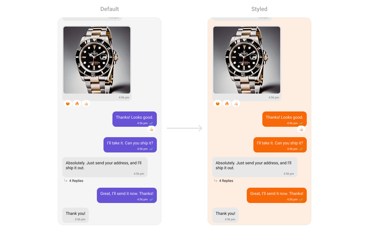
- App.tsx
Functionality
These are a set of small functional customizations that allow you to fine-tune the overall experience of the component. With these, you can change text, set custom icons, and toggle the visibility of UI elements. Below is a list of customizations along with corresponding code snippets| Property | Description | Code |
|---|---|---|
| user | Used to pass user object of which header specific details will be shown | user={chatUser} |
| group | Used to pass group object of which header specific details will be shown | group={chatGroup} |
| alignment | used to set the alignmet of messages in CometChatMessageList. It can be either leftAligned or standard. Type: MessageListAlignmentType | alignment={"standard"} |
| disableSoundForMessages | used to enable/disable sound for incoming/outgoing messages , default false | disableSoundForMessages={true} |
| customSoundForMessages | used to set custom sound for outgoing message | customSoundForMessages="your custom sound for messages" |
| avatarVisibility | used to toggle visibility for avatar | avatarVisibility={true} |
| scrollToBottomOnNewMessage | should scroll to bottom on new message? , by default false | scrollToBottomOnNewMessages={true} |
| receiptsVisibility | Used to control the visibility of read receipts without affecting the functionality of marking messages as read and delivered. | receiptsVisibility={true} |
| hideError | used to toggle visibility of error state in MessageList | hideError={true} |
| quickReactionList | The list of quick reactions to be set.This list will replace the predefined set of reactions | quickReactionList=["👻","😈","🙀","🤡","❤️"]; |
| hideReplyInThreadOption | used to toggle visibility of Reply in thread option in MessageList | hideReplyInThreadOption={true} |
| hideShareMessageOption | used to toggle visibility of share message option in MessageList | hideShareMessageOption={true} |
| hideEditMessageOption | used to toggle visibility of hide edit message option in MessageList | hideEditMessageOption={true} |
| hideTranslateMessageOption | used to toggle visibility of translate message option in MessageList | hideTranslateMessageOption={true} |
| hideDeleteMessageOption | used to toggle visibility of Delete message option in MessageList | hideDeleteMessageOption={true} |
| hideMessagePrivatelyOption | used to toggle visibility of hide message privately option in MessageList | hideMessagePrivatelyOption={true} |
| hideCopyMessageOption | used to toggle visibility of hide copy message option in MessageList | hideCopyMessageOption={true} |
| hideMessageInfoOption | used to toggle visibility of hide message info option in MessageList | hideMessageInfoOption={true} |
| hideGroupActionMessages | used to toggle visibility of hide group action info option in MessageList | hideGroupActionMessages={true} |
| hideTimestamp | used to toggle visibility of hide timestamp in MessageList | hideTimestamp={true} |
| startFromUnreadMessages | When set to true, the chat will load from the first unread message if unread messages exist, otherwise loads from the latest messages. Default is false. | startFromUnreadMessages={true} |
| showMarkAsUnreadOption | When set to true, shows the “Mark Unread” option in the message actions menu. This option will only appear for received messages, not for the user’s own messages. Default is false. | showMarkAsUnreadOption={true} |
| NewMessageIndicatorView | Custom view component for the “New Messages” indicator. | NewMessageIndicatorView={MyCustomIndicator} |
| newMessageIndicatorStyle | Custom styles for the “New Messages” indicator. | newMessageIndicatorStyle={{ backgroundColor: 'red' }} |
| newMessageIndicatorText | Text to display in the “New Messages” indicator. | newMessageIndicatorText="New Messages" |
Advance
For advanced-level customization, you can set custom views to the component. This lets you tailor each aspect of the component to fit your exact needs and application aesthetics. You can create and define your views, layouts, and UI elements and then incorporate those into the component.Templates
CometChatMessageTemplate is a pre-defined structure for creating message views that can be used as a starting point or blueprint for creating message views often known as message bubbles. For more information, you can refer to CometChatMessageTemplate. You can set message Templates to MessageList by using the following code snippet- App.tsx
DateSeperatorPattern
Specifies a custom format for displaying sticky date separators in the chat. Use Cases:- Customize date formats to match regional preferences.
- Use relative formats like “Yesterday” instead of full dates.
- Highlight weekend conversations with different styles.
- App.tsx
DatePattern
Defines the format in which time appears for each message bubble. Use Cases:- Use 12-hour or 24-hour formats based on user preference.
- Display relative time (“Just now”, “5 min ago”).
- Add AM/PM indicators for clarity.
- App.tsx
LoadingView
Customizes the loading indicator when messages are being fetched. Use Cases:- Show a spinner or skeleton loader for smooth UX.
- Display a “Fetching messages…” text.
- App.tsx
EmptyView
Defines a custom view to be displayed when no messages are available. Use Cases:- Show a friendly message like “No messages yet. Start the conversation!”.
- App.tsx
ErrorView
Custom error state view displayed when fetching messages fails. Use Cases:- Show a retry button when an error occurs.
- Display a friendly message like “Couldn’t load messages. Check your connection.
- App.tsx
emptyChatGreetingView
Custom empty state view displayed in case of chats with AI Assistants. Use Cases:- Show an empty state view for chats with AI Assistants.
- Display a friendly message like “Hey, I am your AI Assistant”.
- App.tsx
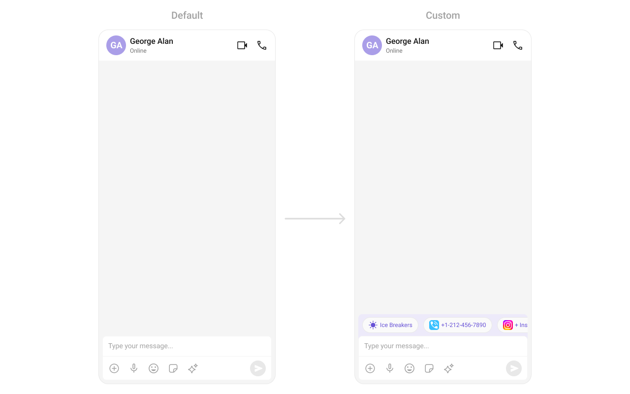
suggestedMessages
Sets the list of suggested messages for AI Assistant chats, allowing you to define which predefined queries or prompts are displayed to users. Use Cases:- Display a list of suggested messages for users to interact with the AI Assistant.
- Provide quick prompts or queries to help users start a conversation with the AI.
- App.tsx
aiAssistantTools
Sets the available tools for the AI assistant by accepting aCometChatAIAssistantTools object that contains tool actions. This allows you to define and manage the tools that the AI assistant can utilize during interactions.
Use Cases:
- Dynamically update UI elements based on tool actions.
- Enable contextual actions based on user interactions with AI tools.
- App.tsx
streamingSpeed
Sets the streaming speed for AI Assistant responses in milliseconds, allowing you to control how quickly the AI’s replies are displayed to the user. Use Cases:- Manipulate the speed of AI responses to enhance user experience.
- App.tsx
hideSuggestedMessages
Flag to hide suggested messages in AI agent empty view (only applies to @agentic users). Use Cases:- Hide suggested messages when you want to show a clean empty state.
- App.tsx
emptyChatIntroMessageView
Custom AI agent intro message view (only applies to @agentic users). Use Cases:- Display a custom introduction message for AI assistants.
- App.tsx
emptyChatImageView
Custom AI agent image/avatar view (only applies to @agentic users). Use Cases:- Display a custom avatar or image for AI assistants.
- App.tsx
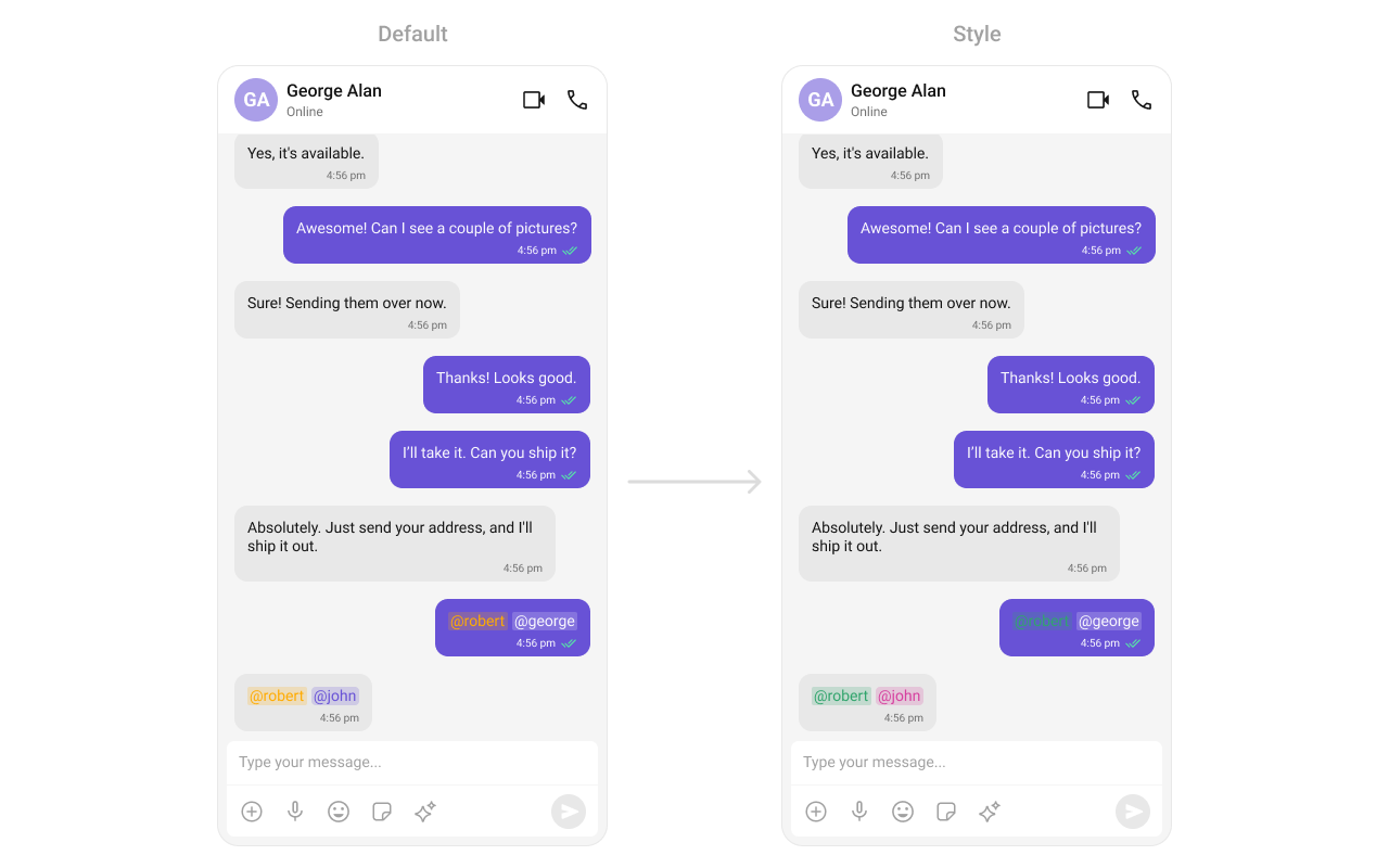
TextFormatters
Assigns the list of text formatters. If the provided list is not null, it sets the list. Otherwise, it assigns the default text formatters retrieved from the data source. To configure the existing Mentions look and feel check out MentionsFormatter Guide- App.tsx
- CustomMentionsFormatter.ts
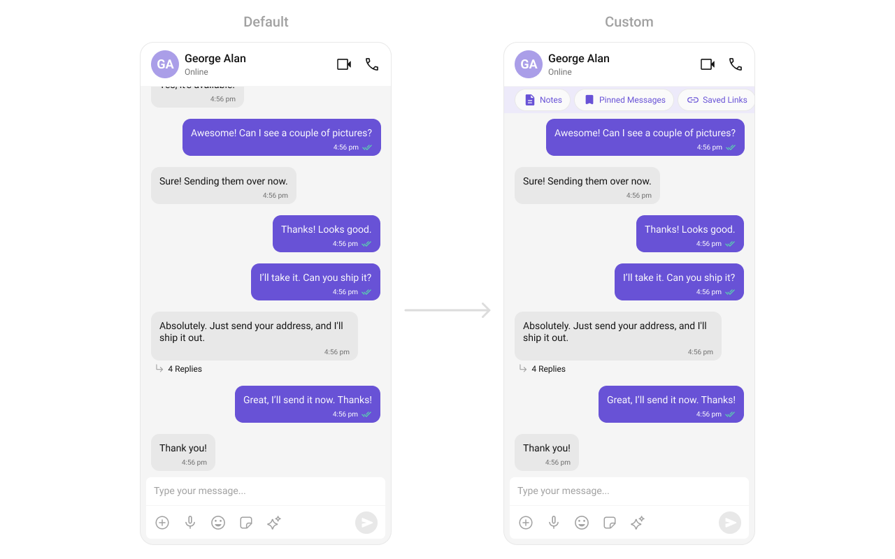
HeaderView
This method allows you to set a custom header view for the message list. By providing a View object, you can customize the appearance and content of the header displayed at the top of the message list. Use Cases:- Add a custom branding/logo to the chat.
- Display chat status (“John is typing…”).
- Show last seen status.
- App.tsx
FooterView
This method allows you to set a custom footer view for the message list. By providing a View object, you can customize the appearance and content of the footer displayed at the bottom of the message list. Use Cases:- Add quick reply buttons.
- Display typing indicators (“John is typing…”).
- Show a disclaimer or privacy notice.
- App.tsx
NewMessageIndicatorView
Custom view component for the “New Messages” indicator. Use Cases:- Create a unique design for the new message notification.
- Add animation or custom behavior to the indicator.
- App.tsx